Get Aligned
Standing up a brand new enterprise-focused product with complex data entry & visualization needs

The Idea
I initially began working with a small tech recruiting firm in a job and talent-seeking capacity. However, as they became acquainted with my skill set, our discussions expanded to include a product idea they were developing. This envisioned product aimed to streamline the process for recruiters, financial decision-makers, and HR personnel by facilitating the rapid collection and organization of crucial details for upcoming talent searches. The goal was to ensure swift and efficient alignment among stakeholders for approval or revisions on each Position Request. To enhance the user experience, we opted to integrate AI suggestions utilizing the OpenAI API.
My Responsibilities
User Experience Design
User Interface Design
UI System Design
UI System Engineering
Frontend Feature Engineering
API Integration
Challenges
Initially, we anticipated several potential challenges. It was evident that the success of the product hinged on delivering a high-quality user experience for AI-assisted data input, necessitating robust form and input components. While React offers extensive utility for managing such components, it's widely acknowledged that frontend work of this nature can swiftly become intricate and demanding.
The second challenge we anticipated was the implementation of a sophisticated organizational structure and user permissions system. As part of the MVP, the application needed to be enterprise-ready, accommodating users who could join and engage with multiple organizations within the platform. Additionally, each organization would require the capability to assign different permissions to its users, ranging from editing privileges to the authority to approve or reject Position Requests, particularly from the viewpoint of a financial decision-maker.

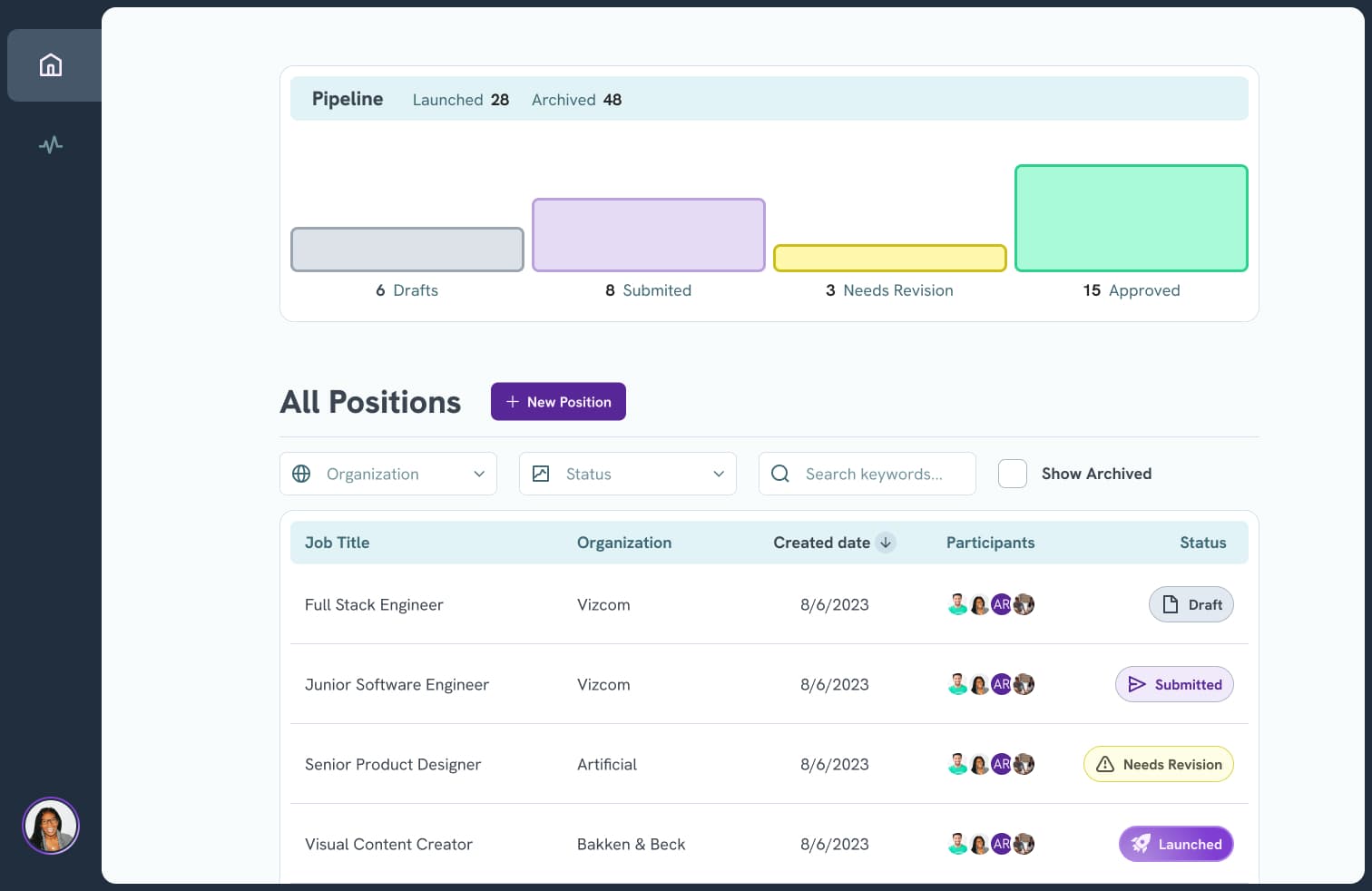
The home page of the user’s dashboard, showing a list of all Position Requests, as well as a bar graph of how many Position Requests are represented by each possible Status.
The Approach
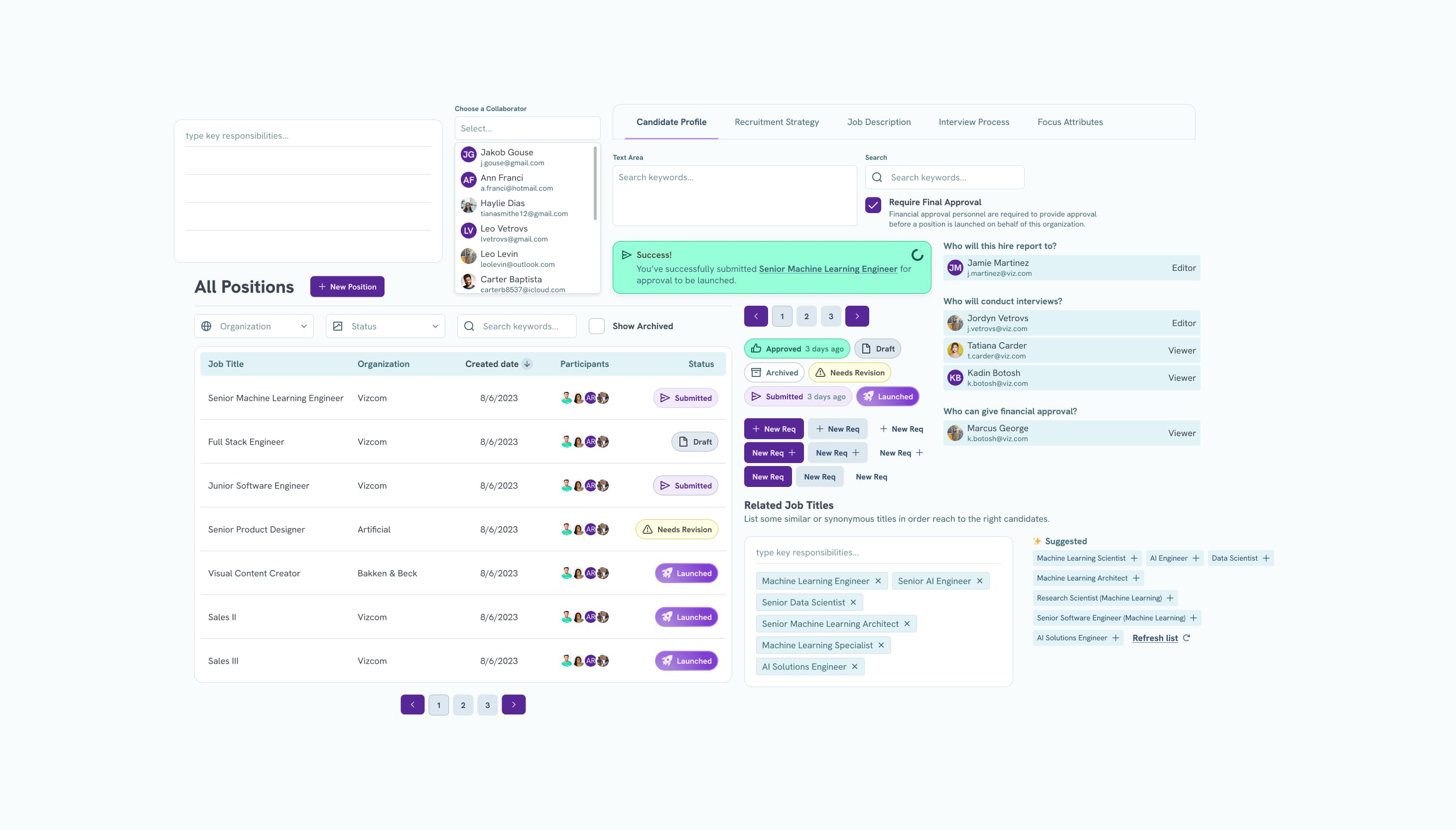
Given a high level of complexity in the data input UI, I knew that a thoughtful UI system methodology would be crucial to success. A few core tenets of this include:
Develop UI components thoroughly and completely, but nothing more than the UI asks. It’s easy to get lost in adding functionality to components, but having acted as the designer of this product I had internalized the exact needs of each component, allowing me to work quickly, effectively, and accurately. This leaves extra room for things like ensuring screen reader compatibility at a very minimal cost, and leaves the door wide open for UI iterations down the road.
Develop variables and components in sensible succession to one another. In the early stages, this is simply a process of focusing on components with the lowest complexity first, and incorporating them atomically within each other as new components and capabilities are added to the UI system. As the product advances to its post-launch life, this practice involves developing components only as the need comes up within the feature development process, instead of trying to predict the future and ending up with a component graveyard full of unused code.
Opt for global, semantic tokens over localized variables whenever feasible. This not only enhances UI consistency and improves the developer experience but also plays a pivotal role in laying the foundation for future iterations as the product launches to its beta testers and customers.
As for our authentication, user role, and user organization service, I knew it would be worthwhile to find a low-cost solution for the API which would allow user and org management via the frontend application. After reviewing several options, the team landed on Clerk as a way to reduce the number of developers required to stand up and integrate the authentication API. Although the demands of our product meant that the implementation wouldn’t exactly be simple still, this allowed us to be flexible, secure, and highly capable from the get-go without having to see very far into the future of our application. Going forward, only a frontend developer is necessary to make changes to the user and org services.
A video clip of one our custom list inputs, including a list of OpenAI-powered suggestions.
The Execution
Over a span of approximately 7 months, we successfully crafted a comprehensive MVP product, of which I am particularly proud. The initial discovery and design phases occupied roughly twelve weeks, during which we maintained a steady pace, albeit slightly slowing down for the more intricate aspects of form input UX design. Once the UX and UI designs reached a satisfactory stage, I transitioned to developing the majority of UI components while the backend application development gained momentum. In the final eight to twelve weeks, my focus shifted to assembling the UI system components to construct features, alongside integrating our new backend API and user organization and roles system, constructed using Clerk.

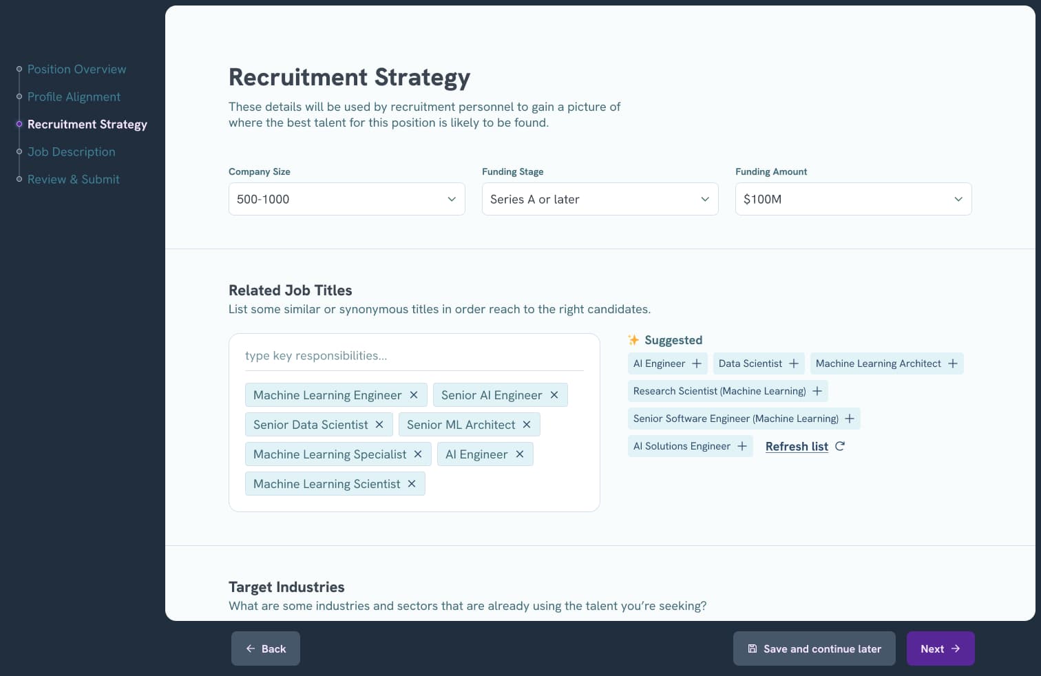
The third step of the Create Position Request flow. This is where a user can add context such as synonymous job titles, or target companies and industries or to recruit from.

The home page of the user’s dashboard, showing a list of all Position Requests, as well as a bar graph of how many Position Requests are represented by each possible Status.