Flatiron School
Eliminating UI tech debt by systematizing 3 frontend web applications for students, teachers, and faculty
The Scenario
Flatiron School, a renowned tech industry bootcamp, enlisted me as a Staff Designer with the goal of bolstering the design team's capacity to handle new feature design across its three internal web applications tailored for students, teachers, and faculty. Much of the UI had been developed and implemented using a somewhat disjointed methodology, leading to issues with consistency, maintainability, and overall performance. Given that the company housed three apps within a monorepo, it became evident that implementing a fresh UI system would address these challenges and facilitate smoother iteration processes in the future. Additionally, an overhaul of the UI was necessary to incorporate user-selectable light and dark mode themes, prompting a comprehensive ground-up redesign.
My Responsibilities
User Experience Design
User Interface Design
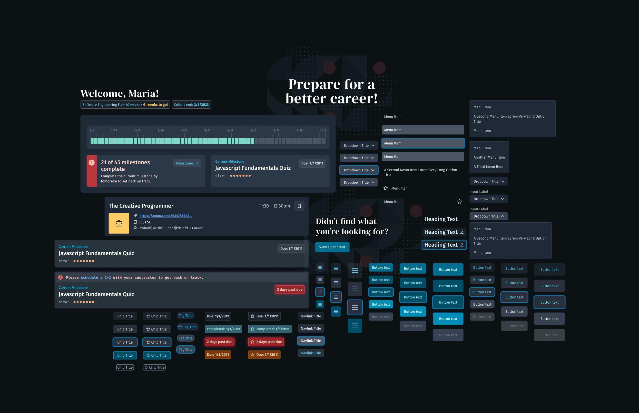
UI System Design
UI System Engineering
Challenges
One of the most significant constraints pertaining to UI progression was the fact that we could not halt feature development, given the significant value these applications provided to the growing business. With students, teachers, and faculty utilizing the applications many times per week, the software had become a distinguishing factor in the competitive landscape of tech industry bootcamps. Moreover, demonstrating a high standard of software development was crucial to the business, as it underscored the importance of quality practices to program graduates. It became evident that advancing the product while addressing the substantial UI technical debt would require a proactive and assertive approach.
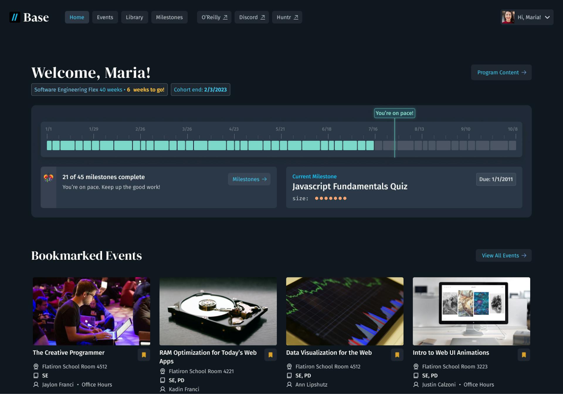
The home page of the student-focused application, Base, which helps students track their course progress, find additional educational content, and find academic events.
The Approach
Thanks to the commitment of my former superior, Matt Donovan , the Flatiron team was already ramped up on the Shape Up approach to application development, which meant that we worked in 6-week development cycles. Each cycle commits the vast majority of resources (typically two to four developers and designers) to one or two sets of features. This created an excellent opportunity for me to handle the feature design during the first part of each cycle, and subsequently shift focus to UI system implementation during the remaining days and weeks. The rest of my cycle team would remain focused on engineering features and satisfying business goals.
Throughout numerous product cycles, we systematically replaced the entire UI, feature by feature, until the new UI system encompassed the entirety of the product UI across all three applications. By adopting this approach, we developed UI system components only as they became necessary for implementing new features and updates. This strategy helped us prevent getting overwhelmed by looking too far ahead, a common pitfall that often results in the creation of unused or unnecessary components.
Lastly, and arguably most crucially, I recognized that this approach necessitated highly accessible and maintainable documentation. Leveraging TypeScript and Storybook, I efficiently generated a substantial volume of documentation at minimal labor cost. Furthermore, adopting a robust TypeScript-based approach proved immensely beneficial; developers could readily grasp how to utilize a given component solely based on its type definitions, even before consulting the Storybook documentation.
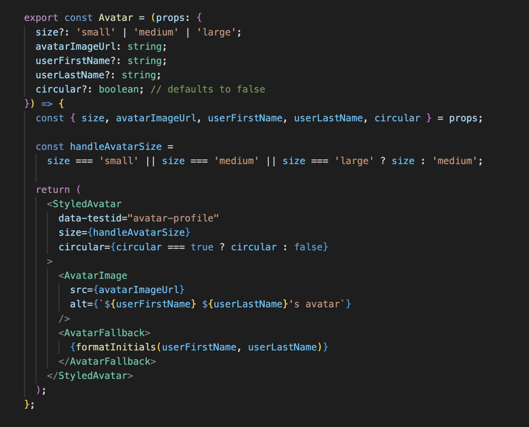
A code snippet exemplifying how strict Typescript practices create error-resistant, self-documenting components.
The Execution
Over a span of approximately 12 months, I successfully executed a comprehensive overhaul of all three application UIs, ensuring compatibility with screen readers, keyboard navigation, and mobile devices. Throughout this process, we continued to advance our feature offerings, effectively meeting the needs of our substantial user base. When the time came to introduce a feature enabling users to select between light and dark themes, we efficiently managed the required UI updates, theme design, and implementation within a mere three weeks. The implementation of the UI system significantly reduced friction in our iteration process compared to the previous year, showcasing its effectiveness and providing immense satisfaction in witnessing its impact firsthand.
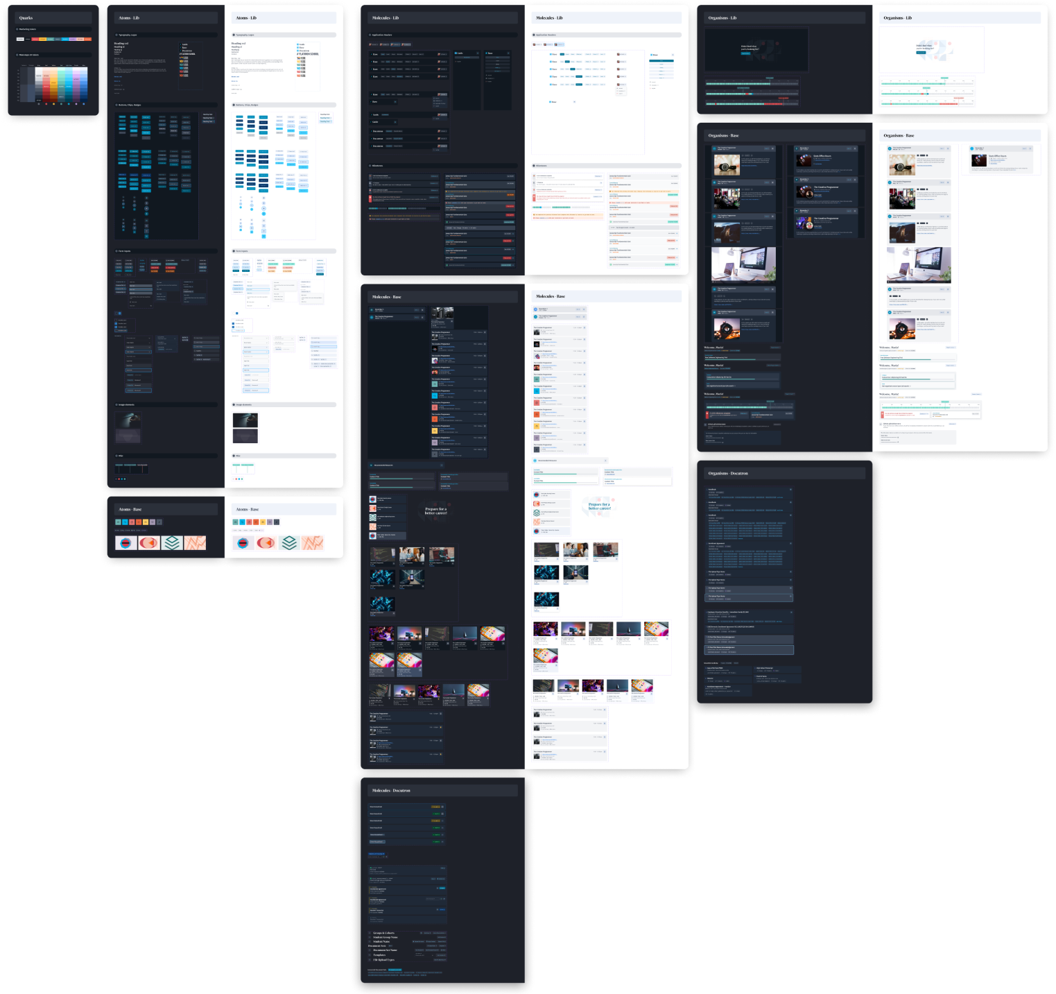
The UI system including our lightning-fast light mode theme design.